


By Maliha Rehman
Why should a brand opt to reinterpret its 23 years long stronghold in retail by opting for a logo change? Why should Khaadi, in particular, do so, inciting strong reactions from loyalists who had come to accept the longstanding logo as their own? Perhaps because, at Khaadi, this change is hinting at many more evolutions unfolding within.
More than two decades ago, the first Khaadi store opened up in Karachi’s Zamzama area with hand-woven fabric being its sole raison d’etre. A small task force comprising merely five weavers peered over their handlooms to create the multicolored swathes hanging on the racks, in unstitched versions as well as stitched into androgynous all-purpose kurtas. The logo – now a very familiar one – represented the knuckles of the hand-weaver, bent purposefully over the loom.
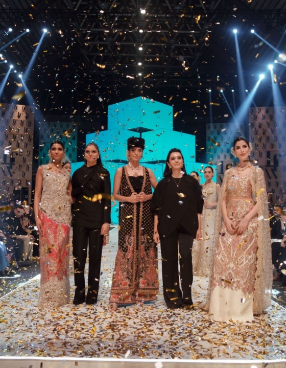
The brand has metamorphosed into a very different behemoth since those initial steps into retail. It has spearheaded an increasing demand for ready-to-wear in Pakistan and up-ended retail experiences with the introduction of mega-stores following a uniform signature cement-and-earth interior. It has diversified beyond the handloom to myriad sub-ranges; luxury-wear, unstitched lawn, pret, accessories and home interiors. It has mushroomed from that single standalone store in Zamzama to a large network spread across Pakistan as well as internationally.

The weaver identifiable through the logo comprises only a small fraction of what Khaadi is now. CEO Shamoon Sultan and Chief Design Officer Saira Shamoon knew that it was time for a change.
“We had been contemplating over a logo and brand asset change for almost two, three years,” reveals Saira. “Khaadi’s journey has been one of discovery and development. Evolution in design has always been part of the brand’s DNA and with each successive year, we have expanded on to new ranges and techniques. In more recent times, though, the brand’s focus had shifted to growth, and it was very important for the business that Khaadi should be available all across the country.”
Simultaneously, though, the retail revolution pioneered by Khaadi filtered all through the high-street. Mega-stores cropped up by the dozens, many of them getting ‘inspired’ by the minimal Khaadi aesthetic. Pret, varying from formals to casuals, womenswear to clothes for children and men, became ubiquitous. It was time that Khaadi quite literally ‘shed its skin’ and progressed to the future.


“The logo is indicative of how Khaadi has evolved and will continue to evolve in the future. Two decades ago, we started off by catering to a different customer,” describes Saira. “That customer has a new mindset now, as do we. There’s a new generation of clientele that is looking towards our store and they are more empowered and more revolutionary in the way they are thinking.”
“The new logo started off as a mere scribble and even that is something that is done by hand. The craftsman’s hand is still an inherent part of Khaadi but so are many more expressions of creation.”
What does this new expression mean for the brand? Evidently, a change in product lines will be seen, the stores are going through a revival and Khaadi is going to be exploring new avenues. The refreshed brand identity is targeted at a younger audience and involves a progression in all aspects of the brand including design, product, aesthetics, and retail experience.

I am reminded of the opened up of the whopping 22,000 square feet store in Karachi’s Dolmen City Mall back in 2016. The store had been a game-changer, inviting customers to explore the Khaadi ‘world’ and was followed up by many more colossal mega-stores. Other brands had quickly followed suit. Now, I am told that a new Khaadi store – bigger and better, I presume – is about to launch, once again hoping to set trends.
The change in logo, in that case, is only a precursor for exciting things to come.

What do you think?